- Support Home
- Knowledge Base
- Campaigns And Activities
- Content
- Working with Dark Mode
Related articles
Need some help?
If you have questions or can't find what you're looking for, we're here for you.
Taguchi Support is available Monday to Friday, 9am - 5:30pm AEDT.
Create New TicketTaguchi Certified Training
Join our free and live online training sessions. You'll benefit from a better understanding of the platform's features and functionality. Plus with Taguchi Certified Rewards, every session you attend, you're not just learning - you're earning your way to some fantastic rewards.
About Taguchi Certified RewardsAPI Version 5
Did you know Taguchi has an API that supports all of the functionality provided by the admin interface and more?
Explore API Documentation
Thanks for your feedback!
Working with Dark Mode
Dark mode is fast becoming the latest trend in email marketing and it's quickly taking over the inbox. Email developers and designers need to consider optimising emails for accessibility and their target audience.
In this article, we'll break down which email client's use dark mode, how each email client’s Dark Mode settings impact your email designs, and what you can do to improve your emails for subscribers that read in Dark Mode.
A quick overview on Dark Mode
Below is a list of email clients that support dark mode:
| Mobile apps | Desktop Clients | Web Clients |
|---|---|---|
| iPhone Mail | Apple Mail | Outlook.com |
| iPad Mail | Outlook 2019 (Mac OS) | |
| Gmail App (Android) | Outlook 2019 (Windows) | |
| Gmail App (iOS) | ||
| Outlook App (Android) | ||
| Outlook App (iOS) |
How are email clients applying Dark Mode in emails?
It is important to note that email clients handle Dark Mode differently, usually in one of three ways:
No colour changes - In HTML emails the user interface changes, but there is no impact on how your email renders (unless it's plain text, but you can add a 2×1 image as part of the code to block plain text from automatically switching to Dark Mode).
Partial-Colour invert - Email clients detect light backgrounds and invert them to dark. The dark text also becomes light. Most email clients that use this option allow for Dark Mode targeting 1 .
Full-Colour invert - Inverts the light backgrounds to dark and dark text to light but also inverts light text to dark. Current email clients that support this option don’t allow Dark Mode targeting.
1 Dark Mode targeting means that you can override the automatic application of Dark Mode by the email client, but not necessarily the user preferences. This is for reference only. Dark Mode targeting is not supported on all email clients, and therefore alternative solutions should be sought.
Email Client Support Chart (as of July 2020)
| Email Client | HTML Treatment in Dark Mode |
|---|---|
| iOS Mail | No colour change |
| Apple Mail | No colour change |
| Outlook.com | Partial invert |
| Outlook 2019 (MacOS) | Partial invert |
| Outlook 2019 (WinOS) | Full invert |
| Outlook app (iOS) | Partial invert |
| Outlook app (Android) | Partial invert |
| Gmail app (iOS) | Full invert |
| Gmail app (Android) | Partial invert |
Optimising Images and Logo's
A brand's logo can sometimes get lost in the background when dark mode is activated, this is because some email clients might decide to use either Partial Colour Invert or Full Colour Invert settings.
To resolve this, you can add a translucent outline to transparent PNGs with dark text for legibility.
| Original Logo | Dark mode - Gmail App (iOS)
Before |
Optimized Logo | Dark mode - Gmail App (iOS)
After |
|---|---|---|---|
|
NOTE: A black background is added to the logo above to display the white logo. |
|
|
|
|
|
|
NOTE: A black background is added to the logo above to demonstrate the difference between the original logo and the optimized logo. |
|
Key points:
- In most cases, images that are PNG/GIF/JPG are not affected.
- Some email clients (i.e. Gmail App (iOS)) with text over background images, can be inverted and the contrast is not checked.
- Avoid using images that match the background colour in the HTML and instead use transparent PNGs.
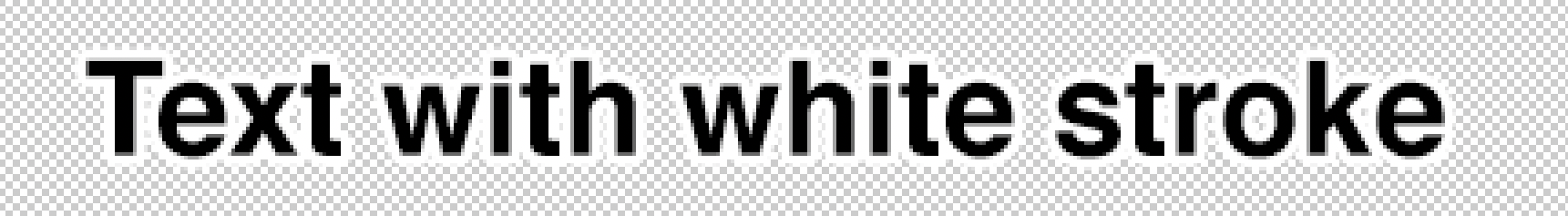
- For smaller images, logos, or text as images, and anything with thin dark lines, consider adding a stroke around the design to enable it to standout on a darker background.
Using Colour Gradients
If you choose to use a linear gradient in the background, or as a CTA button, it can make the content difficult to read on dark mode. This is because gradient colours are not being read as colour in dark mode, that's why the email client ignores it and doesn't invert it.
| Linear gradient | One Colour gradient | |
|---|---|---|

Gmail App (iOS) |

|

Gmail App (iOS) |
Text, Live Text, rendr.it & Background Colours
Using live text rather than text in images is best for accessibility, deliverability, and is easier for most email workflows. However, colours are subject to change when Dark Mode is activated.
In almost all instances, using pure colours such as white text (#FFFFFF) or black text (#000000) will cause the colours to swap when Dark Mode is activated.
| Light Theme | Dark Mode |
|---|---|
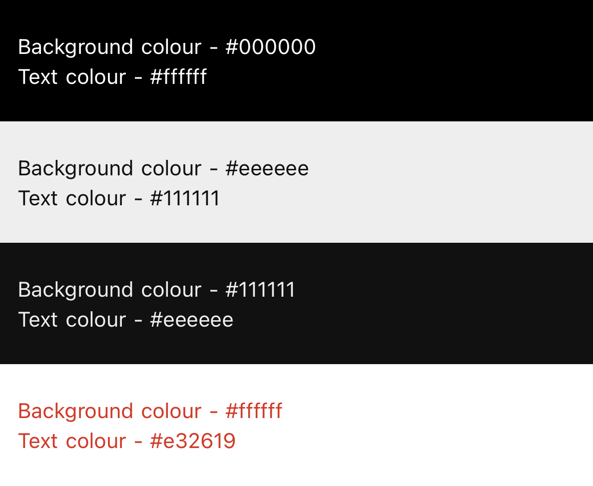
Gmail App (iOS) |
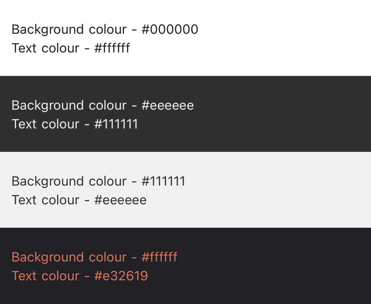
Gmail App (iOS) |
If it's a rendr.it with text, and the text is black on a white background as an image, it is best to use a transparent PNG with a stroke around the text to match the background in the default light email:
But we would always advocate for live HTML text and avoid use of rendr.it with text when possible. We recommend using a web-safe font for text or you can use a custom font with a web-safe font as a fallback.
Wrapping Up
As more email clients adopt Dark Mode, it would be a good idea to start considering your template design when Dark Mode is activated.
Key considerations/points:
- Check how the text displays in dark mode - i.e. Body text, headings, terms & conditions
- Check how the assets display in dark mode - i.e. Logo's, social media icons, buttons, etc
- Use one-colour-gradients for backgrounds
- Use images with transparent backgrounds
- Add a translucent outline to transparent PNGs - i.e. Add a white stroke to a black logo or a black stroke to a white logo
- Test on different email clients with different colour invert changes. - i.e. Outlook 2019 (macOS) - Partial colour invert, Gmail App (iOS) - Full colour invert
- If desired, develop versions for light and dark mode