
Theme
Within the templates tab, you have access to Themes and Saved Layouts that that make up your templates. You will need to set up a theme to use for your web page, before you can add content to the activity.
What is a theme?
Themes allow you to set up your templates to follow your brand's creative style and allow you to populate new activities with a consistent theme. This includes standard fonts, colours, call-to-action buttons, footer social media icons and urls and more. Themes can be used across multiple web pages, facilitating easy and efficient web page branding.
For more information on how to create a theme, please visit our V5 Activity Editor User Guide.
Configuring a theme for web
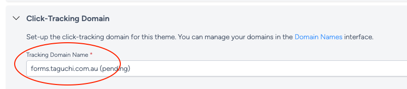
For web pages specifically, please include a click-tracking domain in your theme. This is used to load pages and forms over this domain and helps prevent browser cross-domain issues should you want to iframe a web page. It also allows you to have your brand in the page url.
This can be done by selecting a tracking domain name under the 'Click-Tracking Domain' section of your theme.
For a comprehensive guide on setting up click-tracking domains, please see our article 'How do I set up custom click tracking in my template?'
Activity
Activities are created within the Campaign detail view or on the Dashboard.
Creating a new activity
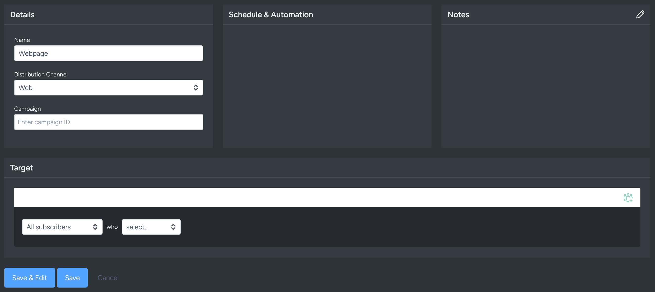
Activities are created by clicking the 'New Activity’ button.
A modal will appear with the following options:
- Name: When selecting a name, we recommend using a logical description.
- Distribution Channel: Web.
- Campaign: The campaign name where the activity is located.
- Notes: Add relevant notes about your activity.
Applying a theme
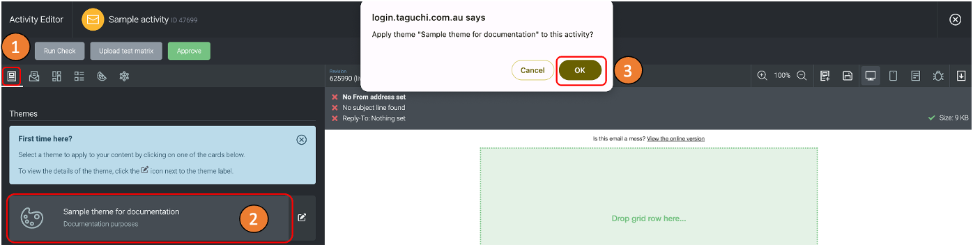
To select a theme, click on the templates tab and scroll down to find your theme.
Once you have found your theme, click on it.
A confirmation message will pop up with two options: "Cancel" and "Ok". Click on "Ok" to confirm the selection. The confirmation message is a precautionary measure to prevent accidental theme selection.
When a theme is selected, all the settings of that theme will be applied to your activity. This includes colours, fonts, sender details etc. Further information on how to create a theme is shared further down in this document.
Saved layouts
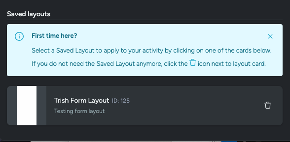
Layouts can be saved within Taguchi, allowing for quick setup of pages following the standard design language of your brand(s). Saved layouts contain all the grid rows and content blocks as they were saved - ready to be customised within your new activity.
To apply a saved layout, navigate the the 'template' tab of the Activity Editor and scroll down to the 'Saved Layouts' section.
Saving layouts
Benefits of saving a layout
Saving a layout allows for later use in other activities.
How to save a layout
To save a layout, navigate to the top of the activity editor to the 'list' icon, located between the zoom options and the 'save revision' icon.
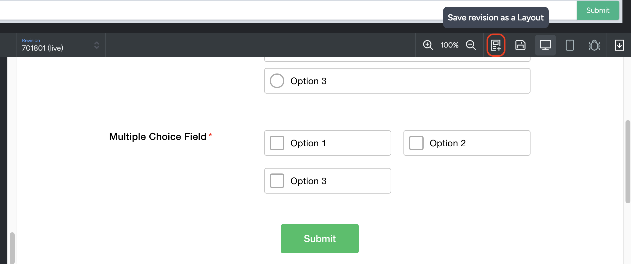
This will require a name and description. Layout names must be unique. Make sure to be descriptive enough (yet brief) to ensure that future users are using the layout correctly in their context.
Deleting a layout
Deleting a layout can be done through the same avenue as applying a saved layout. Navigate to the 'Templates' tab, and scroll down to the Saved Layouts section. Next to each Saved Layout is a trash-can icon. To delete a Saved Layout, select the trash can of which layout you want to delete, and press 'ok' on the following pop-up.
Configuring a web activity
With web activities, there are two variations at your disposal and either can be embedded into an existing website as an iframe.
Select a configuration
Web activity options:
- Web forms
- Web pages
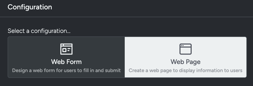
Web forms
Web forms are specifically for collecting information and data from users and can act as a sign-up or opt-in form.
Web pages
Web pages are informational, used to display information to a user.
Endpoint selection & setup
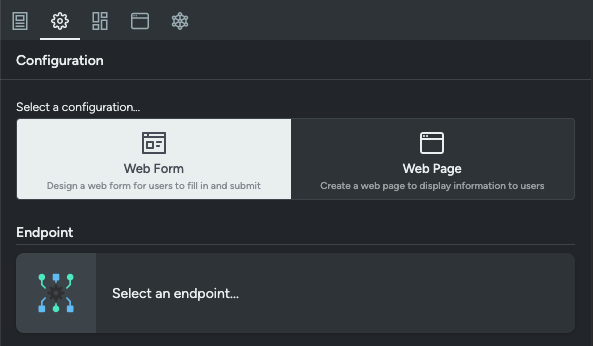
Web forms require an endpoint in order to submit form data into Taguchi.
On selecting an endpoint to use, you have 2 options:
- V5 Unauthenticated Endpoints
- Custom Endpoints
Specific use cases for each ones vary, however a general rule of thumb is that:
- Unauthenticated endpoints are for Web forms that are publicly available, anyone can submit, data is low-sensitivity.
- Authenticated endpoints are for existing users or for private Web forms, you want to track the person submitting, along with general stuff with existing users/subscribers.
For further information on authenticated endpoints, please look at our Endpoint (Authenticated) Integration article
Unauthenticated endpoint
To Create a New Unauthenticated Endpoint select 'Create a New Endpoint' in the top right of the Configuration Box.
For set up instructions please see our article 'Endpoint (Unauthenticated) Integration'.
Custom endpoint
Custom Endpoint URL This will direct users to an endpoint of your own making, this is usually created beforehand by your organisation to be used for data collection (Not just limited to Taguchi Web forms).
Custom Endpoint Method
- POST is used for creating a new resource and submitting the Data to it. Good for creating new profiles. POST repeats can create new profiles.
- PUT is used for updating a resource at a known location. Repeat submissions is the same result.
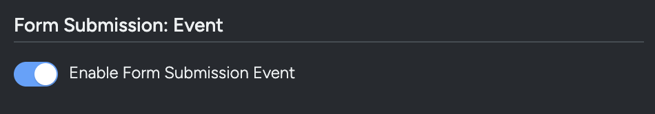
Form submission event
For Form Submissions to present as an event within Subscriber Profiles, you will need to enable this option at the top of the Form Submissions section of the Activity Editor within the Configuration Tab.
Form submission actions
Within this same section, you can designate what happens on a Form Submission in the event of a successful submission or a submission error.
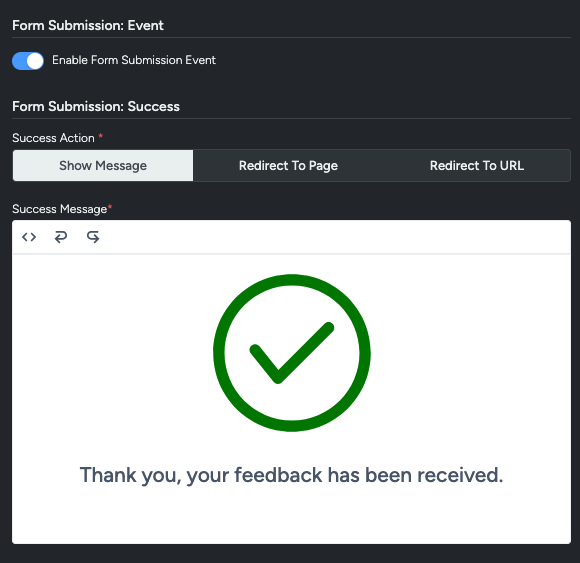
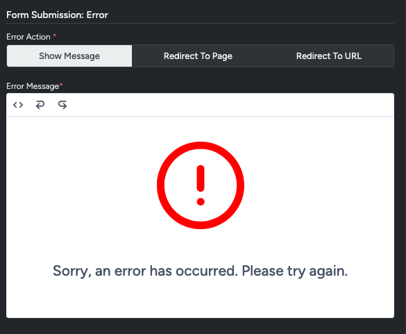
You have three options for either outcome.
Show Message This will display a default message to the the pre-determined failure or success message (including the included icons) - These messages can be customised to include custom text as well.
Redirect To Page If multiple pages are present in an activity, subscribers/users can be redirected to one of the pages on form submission, painting a full journey for users and allowing double-opt in for future communication.
Redirect To URL Allows you to designate an external page outside of Taguchi as a landing page for after a form submission is completed. Please ensure the website is connected to your brand is all set up before linking it, otherwise errors might crop up.
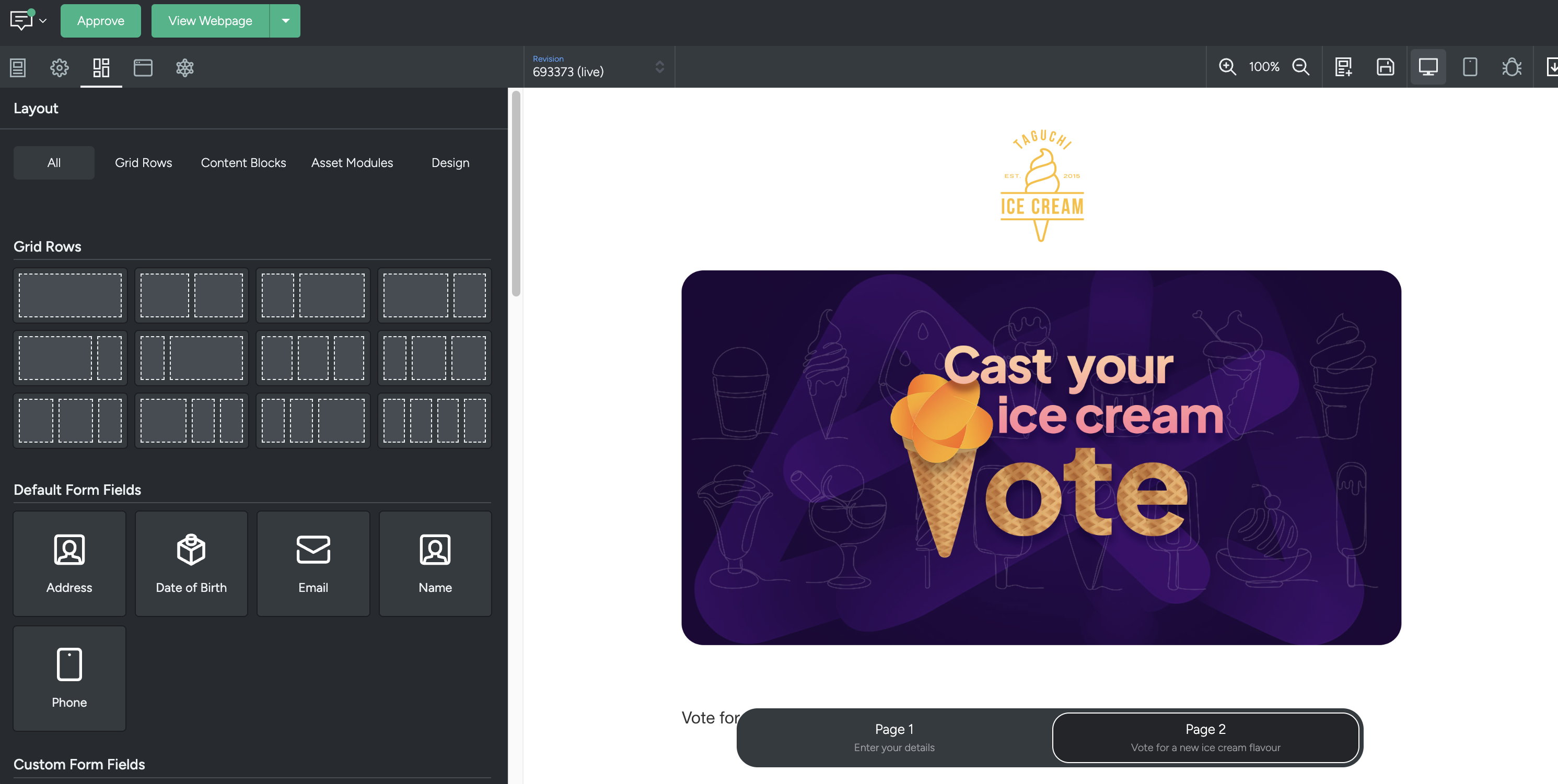
Layout
The Layout tab is where you create content and arrange the overall structure of your activity.
Layout Design
The 'Layout Design' section allows you to customise the overall web page or form settings including:
Content
- Content width
- Mobile breakpoint
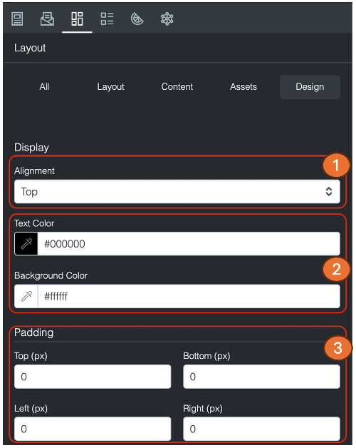
- Background: Set a background colour or background image, including image position, image size, and option to repeat the background
- Content background colour
- Horizontal alignment: Whether the page sits to the left, center or right
- Desktop and mobile content padding
Page
- Text and background colours
- Favicon: A small icon displayed in browser tabs. See What is a favicon?
- Background image: Including image position, image size, and option to repeat the background
- Desktop padding and optional mobile padding
Grid rows
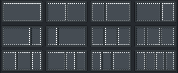
- A grid row allows you to structure your content.
- You can select from an array of commonly used layout options, which divide your web page vertically.
- Grid rows also allow you to group content together. This allows you to drag and drop an entire grid, rather than one content block at a time when re-arranging.
- You can save an entire grid as an asset, making it easier to re-use repeat grouped content.
- You can interact with the content within the activity preview To select a Grid Row, hover over the row until you see the green dotted line. This represents the Grid on that row.
When selecting a Grid Row you'll notice a green title bar appear. The "Title Bar" allows you to drag and drop, duplicate or delete the item within the activity preview.

Content blocks
Content Blocks are where the actual customisation and visual aspect of your activity are controlled. Content blocks are added to grid rows to allow for neat and organised spacing and placement.
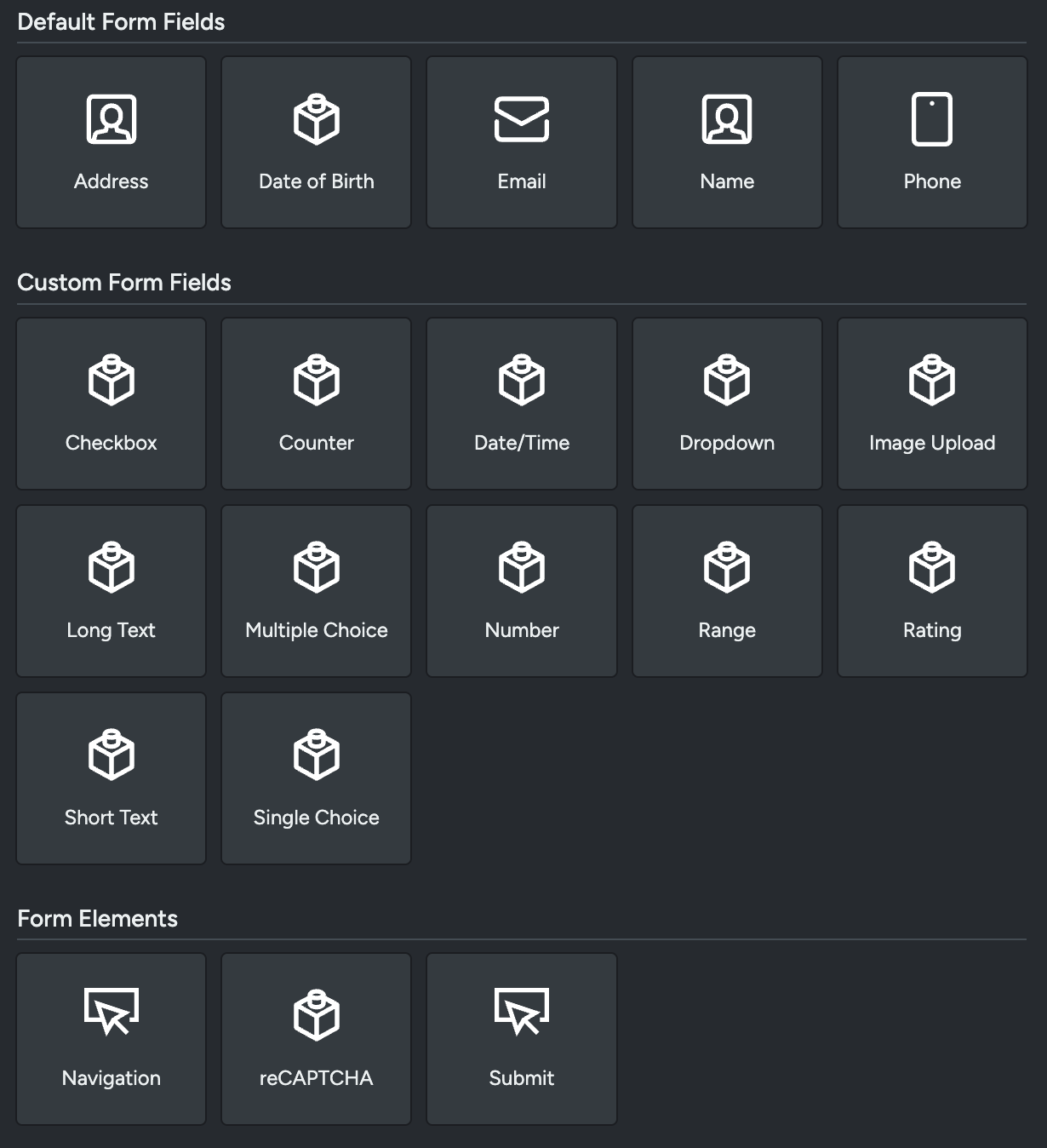
Specific to Web Templates are the following content blocks:
Default Form Fields These are the forms you'd typically find within a webform, and are for gathering basic/default information for Taguchi Subscribers - ie. Name, Address, Email, DOB, etc.
Custom Form Fields Pertains to custom information unique to your organisation or unique to the information you're trying to gather.
Form Elements Related to parts of a webform. Verification, submission or proceeding parts of a webform are found within this category.
Content Blocks Used for customising a webform visually. This can be anywhere from images to match an organisation's branding, to custom HTML, Hero headings.
Asset modules
Add your preferred grid row by dragging and dropping it into the activity preview. This will structure the content of your activity.
The Asset Modules section provides you direct access to your Asset Library. You can search by asset ID, name, tag or External ID – similar to the search function in the Asset Library. You can drag an asset directly into a grid or content block. For example, if you drag in an image asset, an image content block will automatically be created, and if you drag in an article asset, an article content block will automatically be created.
For more information on the Asset Library, see our related article here
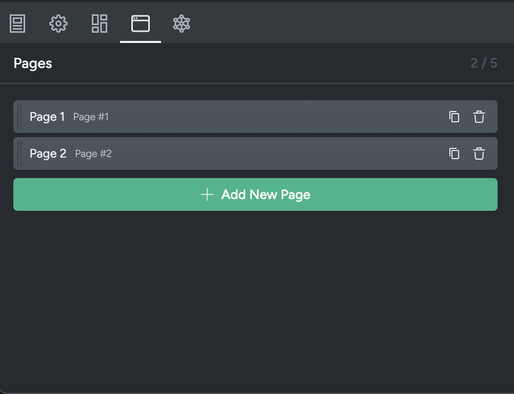
Pages
The pages tab allows you to see the pages associated with your web activity and the grid rows and content blocks of each page.
In this tab you can view the structure/order of the pages in a list view
If you click on a page, you can these see the structure of the page, made up of grid rows and content blocks.
If you click on the content blocks, you expand the blocks to show the block content.
Analytics
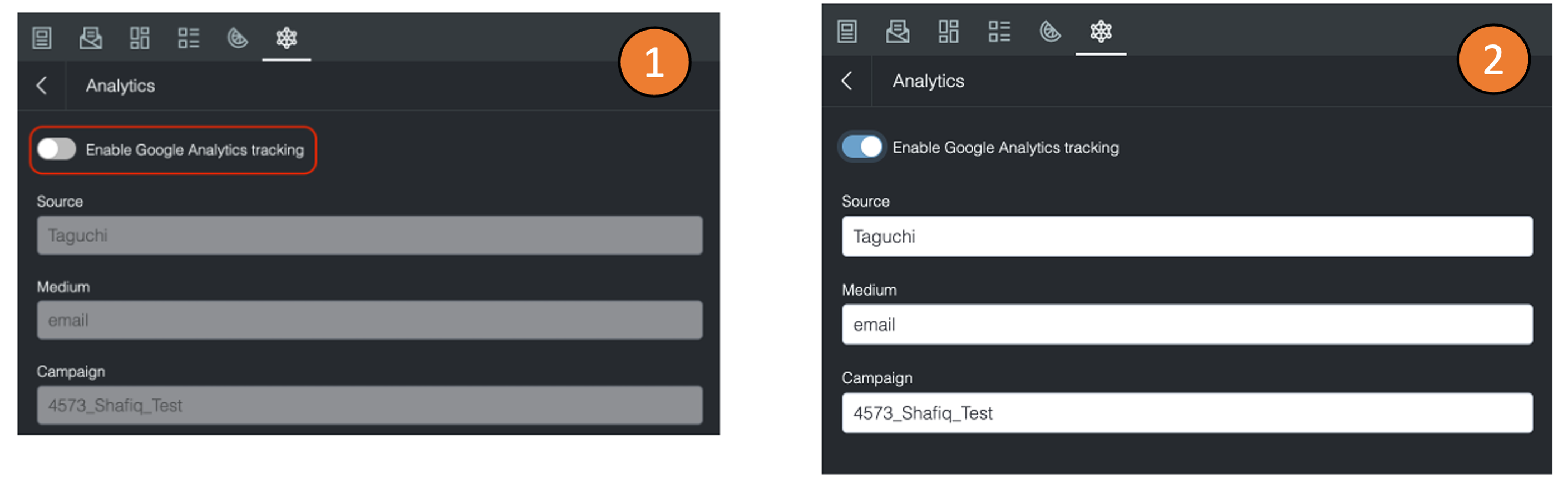
Analytics allows you to use Google Analytics link tracking to track the performance of links In your activity. This is in addition to the analytics settings you've already applied in your theme.
Once you are within analytics, click on the “Enable Google Analytics tracking” button to enable this feature.
You can edit 3 parameters:
Source (utm_source): This parameter identifies the source of the traffic, such as the name of the website or the specific marketing campaign.
Medium (utm_medium): This parameter identifies the medium of the traffic, such as webpage, social media or paid advertising.
Campaign (utm_campaign): This parameter identifies the specific marketing campaign that the link is associated with.
Once you have added the parameters, any links that are within your web page will now have the parameters inserted within the URLs (except text Hyperlinks).
Conditional logic
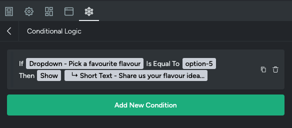
Use conditional logic to control which form fields are shown or how they behave based on a user’s previous responses. This helps you create a more tailored and user‑friendly form by only displaying fields that are relevant.
For example, if a user selects Yes to a question, additional fields will appear. If they select No, those fields stay hidden.
Creating a condition
To create and apply conditional logic to a form, click on the 'Add new condition' button.
Conditional logic is made of two parts. The condition and the action.
In the 'Edit Condition' tab, you can set an 'if' statement that then triggers a 'then'.
For example, 'if' the value of a dropdown field 'Pick a favourite flavour' is 'Other' (i.e. a user selects this option), 'then' show a text field box to capture additional favourite flavours.
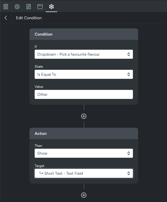
To set this condition up:
- Select a block from the 'if' dropdown e.g. Dropdown
- In State select the rule for the condition e.g. Is Equal To
- In the Value field, input what the value of the field should be to show the additional field e.g. Other
- In the action section, under 'Then' select an action. With this example, we would select 'Show'
- Input a 'Target'. This is what gets displayed when the condition is met. E.g. Short Text - Text field.
Custom CSS
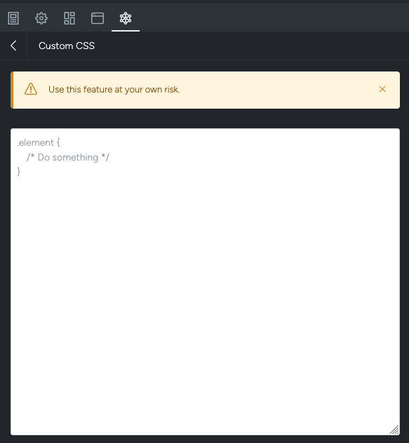
Custom CSS allows extended customisability for the visuals of your webpage. However this does require some basic knowledge of web editing and web development. To cut your teeth on some of the basics to do with CSS editing, there are some openly available resources online.
Custom javascript
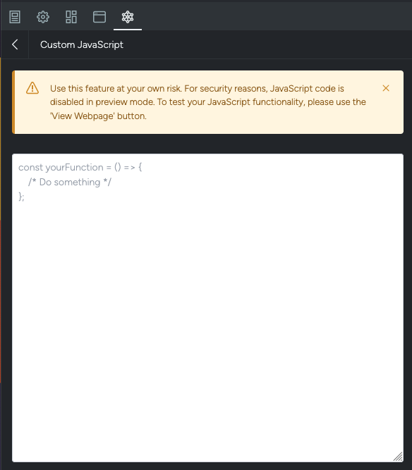
Custom Javascript (or JS), is a way to extend the functionality of your webpage.
Deploying a web activity
To set a web page or web form live i.e. making it available for both subscribers and testing, it must first be approved and deployed.
- In the Activity Editor, navigate to the top-left corner and select Approve.
- Once approved, a new button will appear 'Confirm Deployment'. Select this to deploy the activity.
- After deployment, the web page or web form will be accessible via the 'View Webpage' button.
The View Webpage link reflects only the currently deployed version. Any changes made after deployment will not be visible until the activity is re-approved and re-deployed.
Sharing a web page or form
Once you have deployed your web activity, to share the web page or form, click the arrow next to the green ‘View Webpage’ button.
Share via web
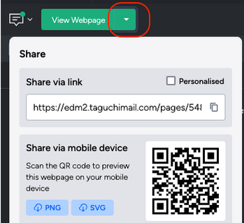
You'll have options to share using the link, and share via mobile device.
Click the 'copy' icon next to the link to copy the link. Check the 'personalised' box to add subscriber parameters to the link.
Personalised links are for use within Taguchi activities (e.g. emails). When enabled, subscriber tracking parameters (e.g. e and sevt) are appended to the URL. This ensures submissions are linked to the correct subscriber profile and prevents anonymous form entries. It also allows event targeting (e.g. entered activity/revision) to function correctly.
To share via mobile device, see this article 'How do I generate a QR code'
Embed a web page or form
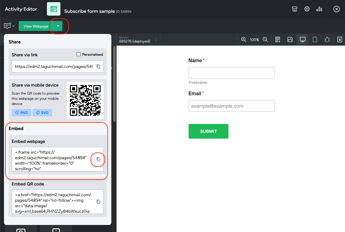
Taguchi webpages can be embedded using an iframe.
Refer to our article on 'How to embed a Taguchi form' for instructions.