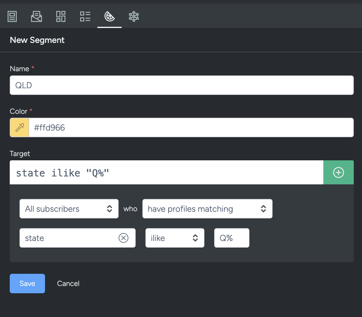
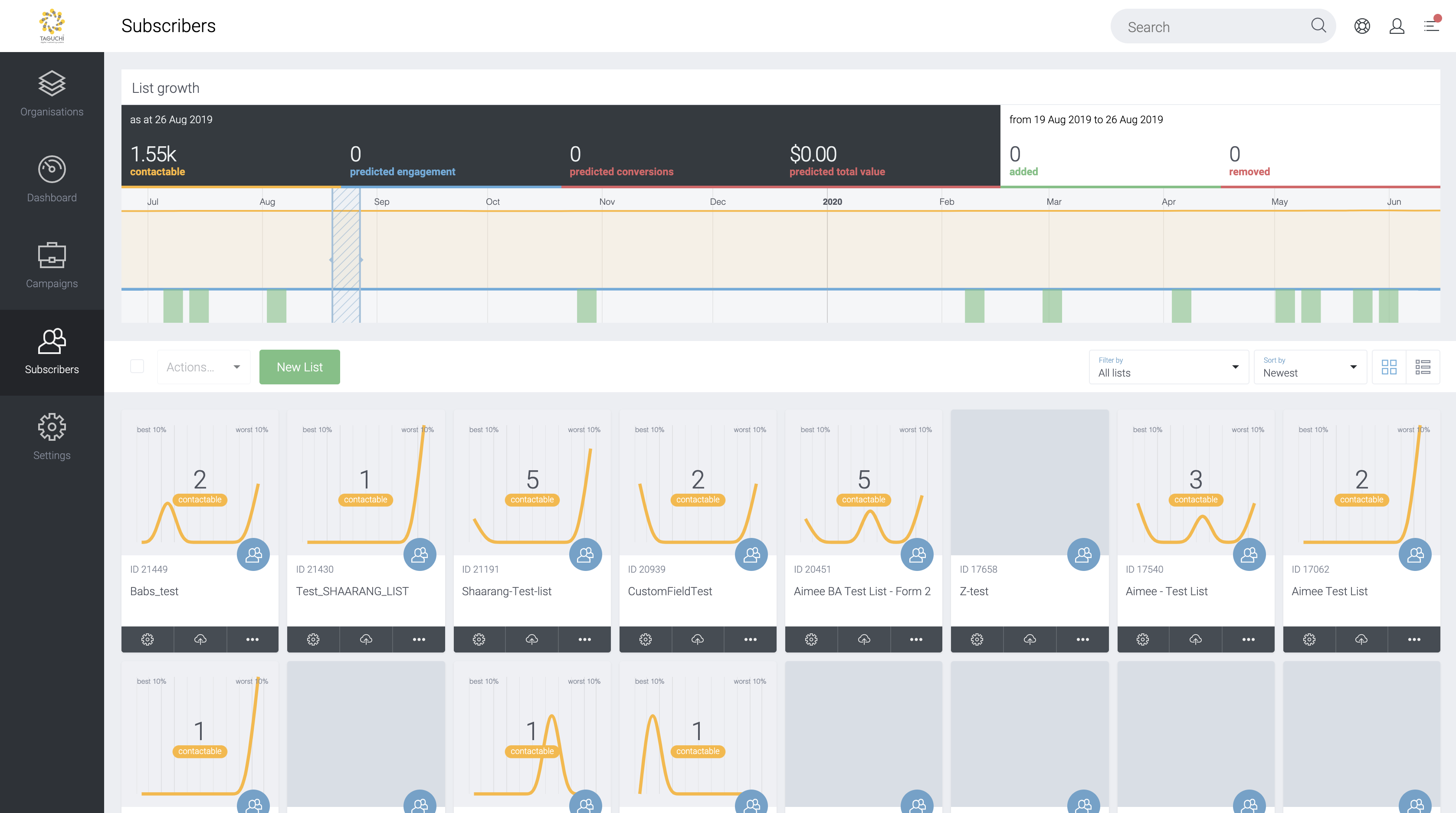
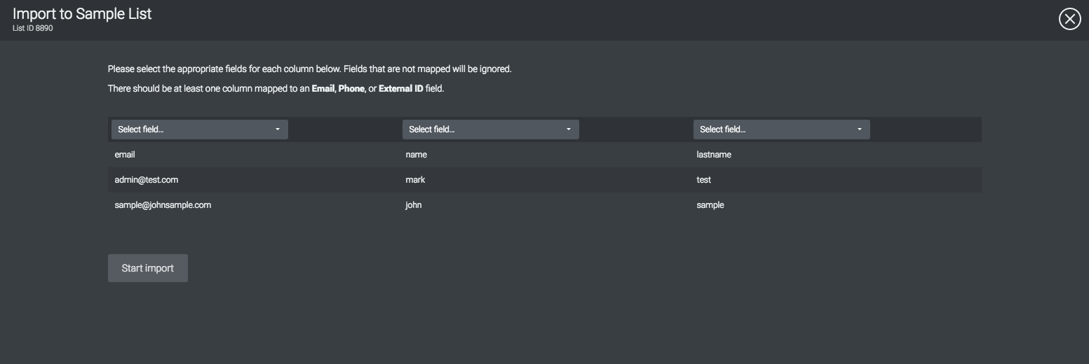
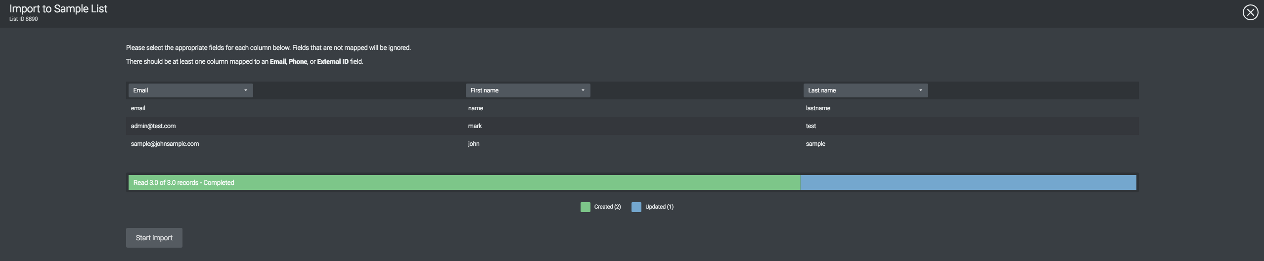
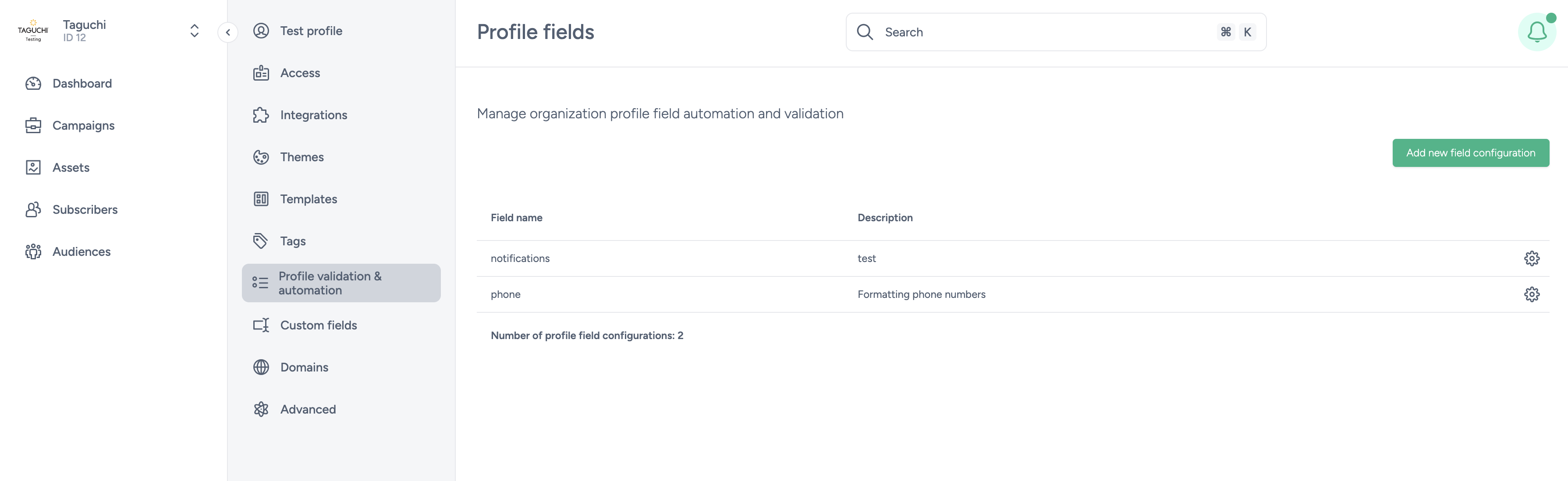
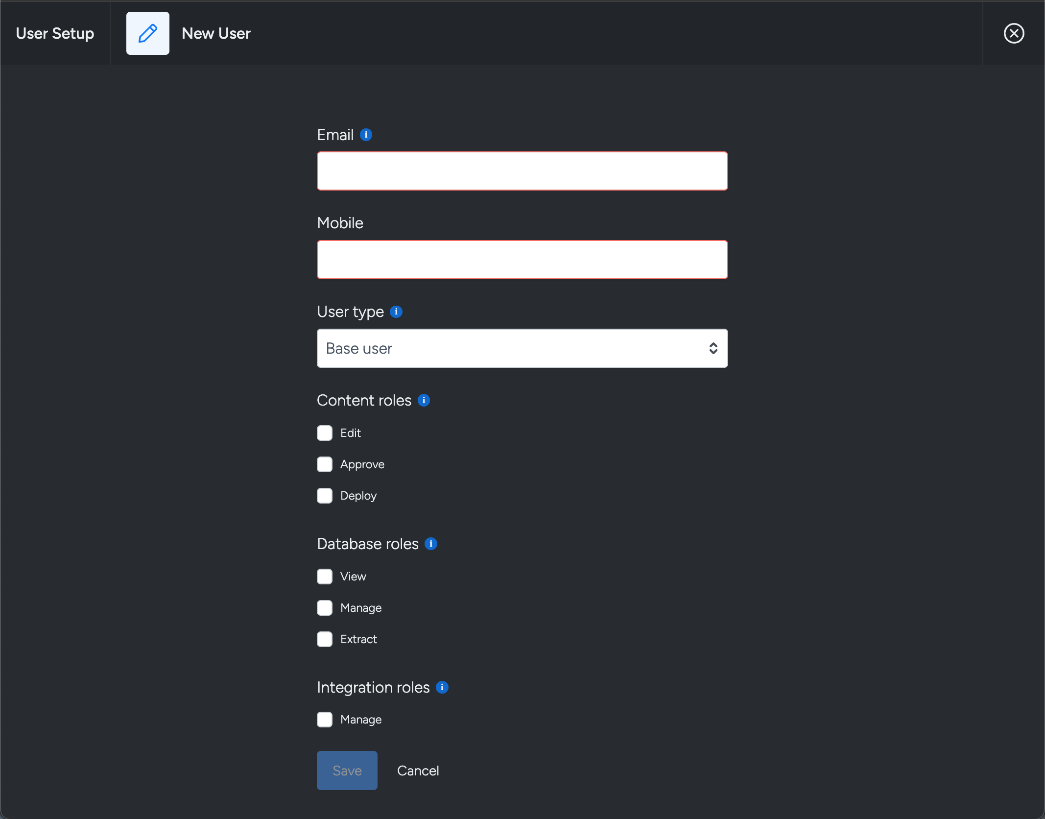
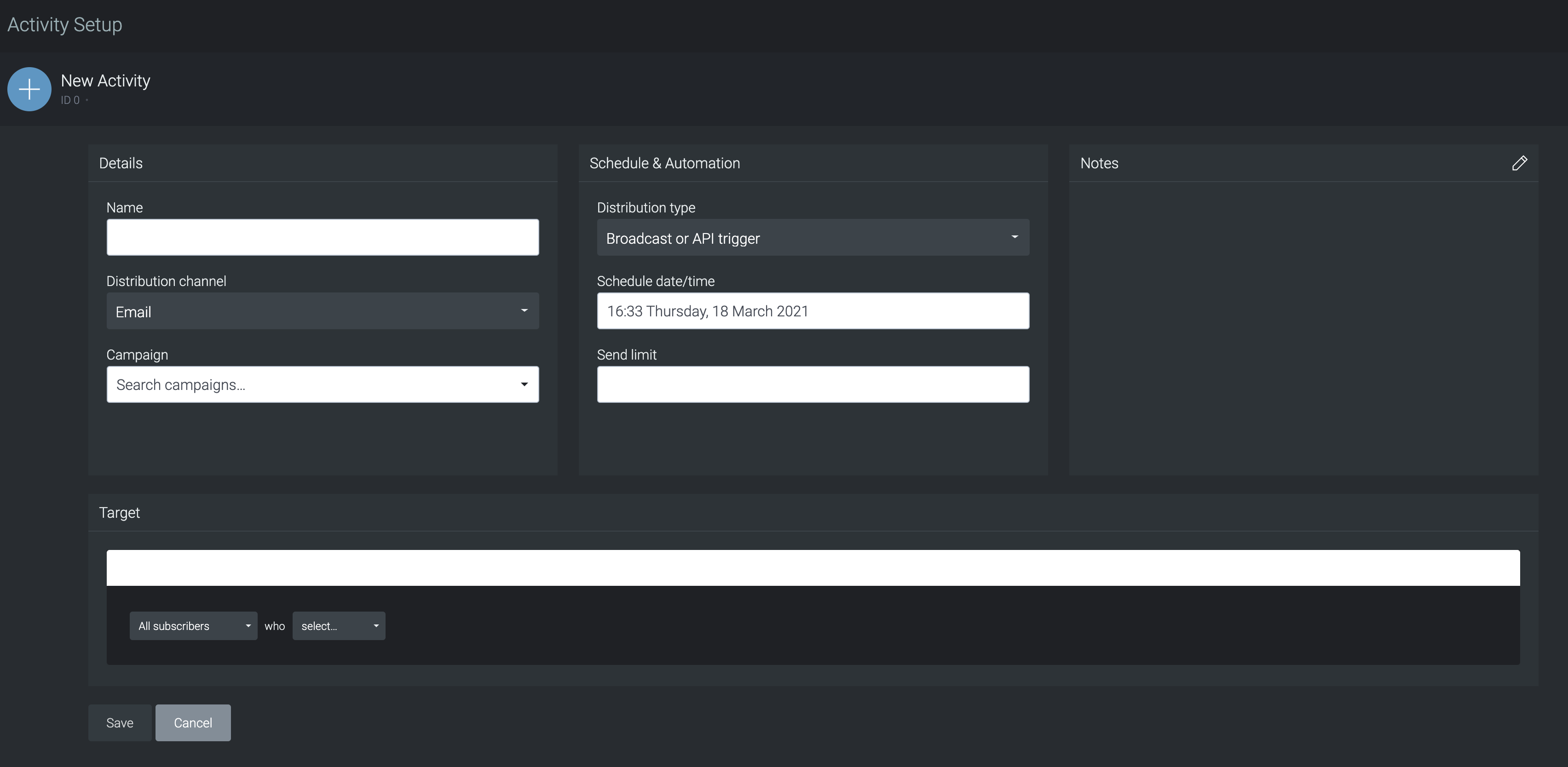
Activity reports
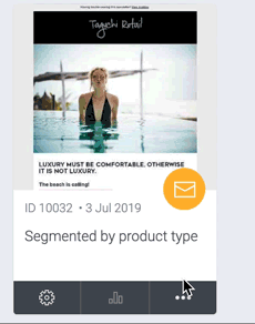
Click the 'Options' menu in the lower right corner of an activity card to access the activity actions. From here, you can access activity specific reports.
Activity reports display the entire history (or selected date range) of the activity. Custom reports may also be acquired (subject to scoping and requirements) - please contact Taguchi® Support for more information.
PDF
To download a PDF report of your activity, simply click the 'PDF' link in the options menu.
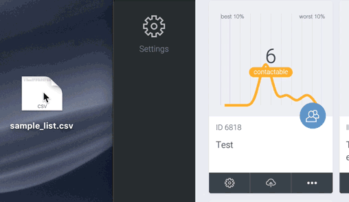
CSV
To download a CSV report of your activity, simply click the 'CSV' link in the options menu.
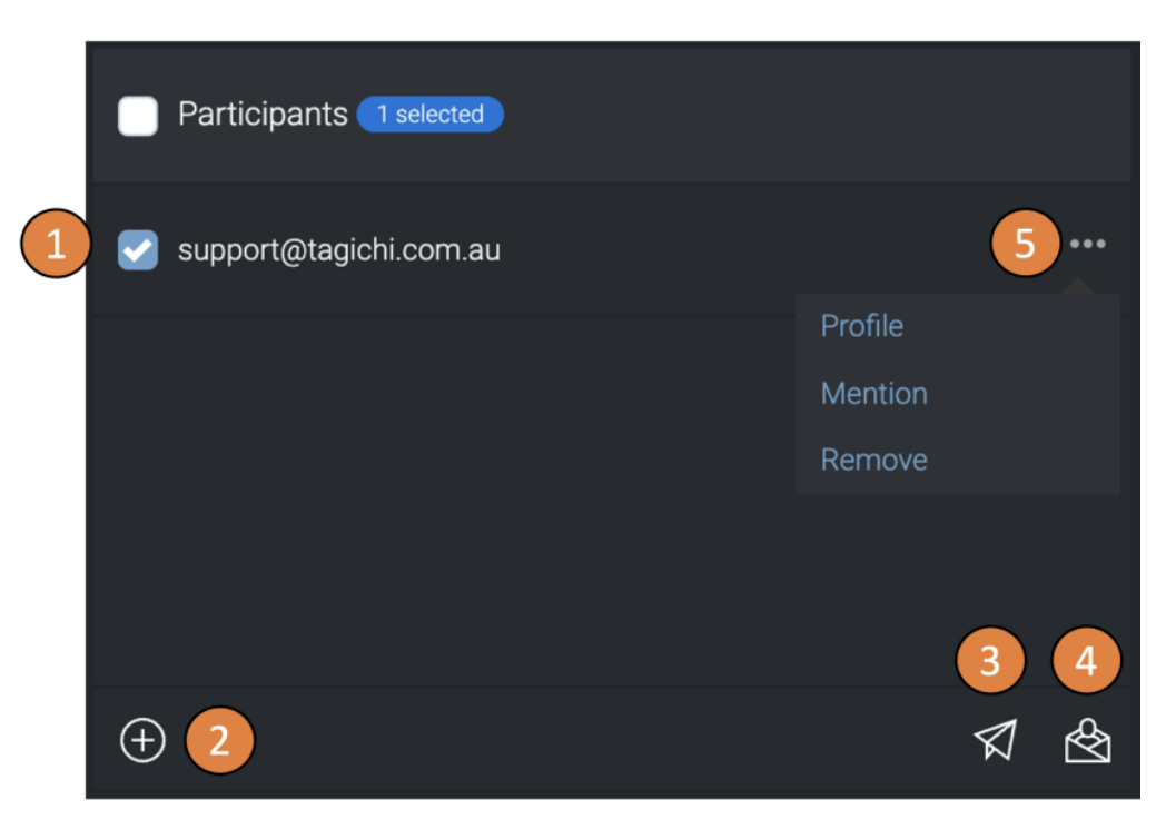
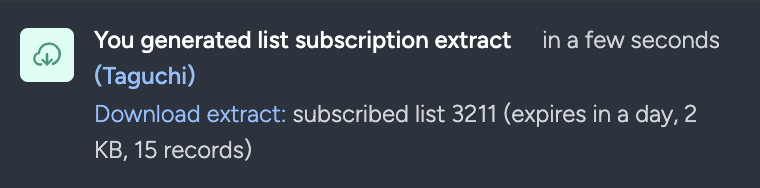
Click this option if you want to download the subscriber list(s) attached to this activity.
View online
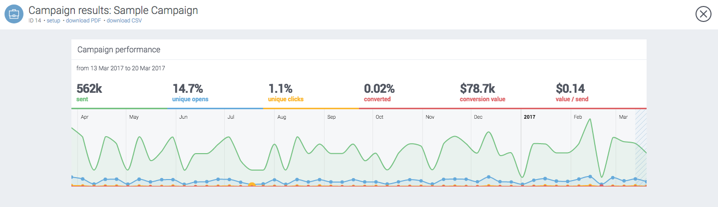
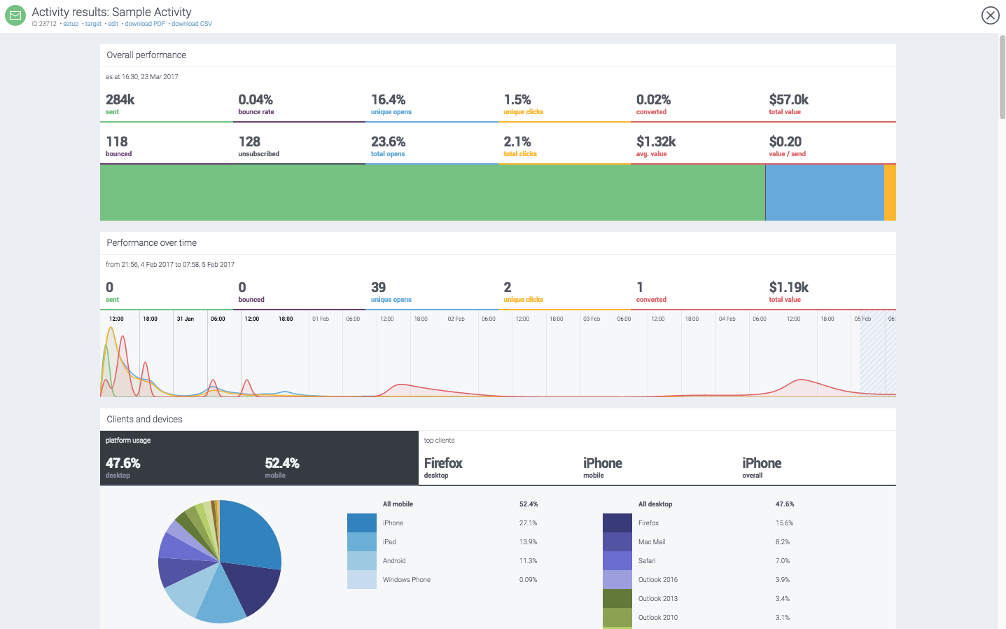
This will take you to the activity report displaying the performance data of the activity. You can also reach the activity report by clicking on the bar graph icon at the centre of the activity card. The activity report contains:
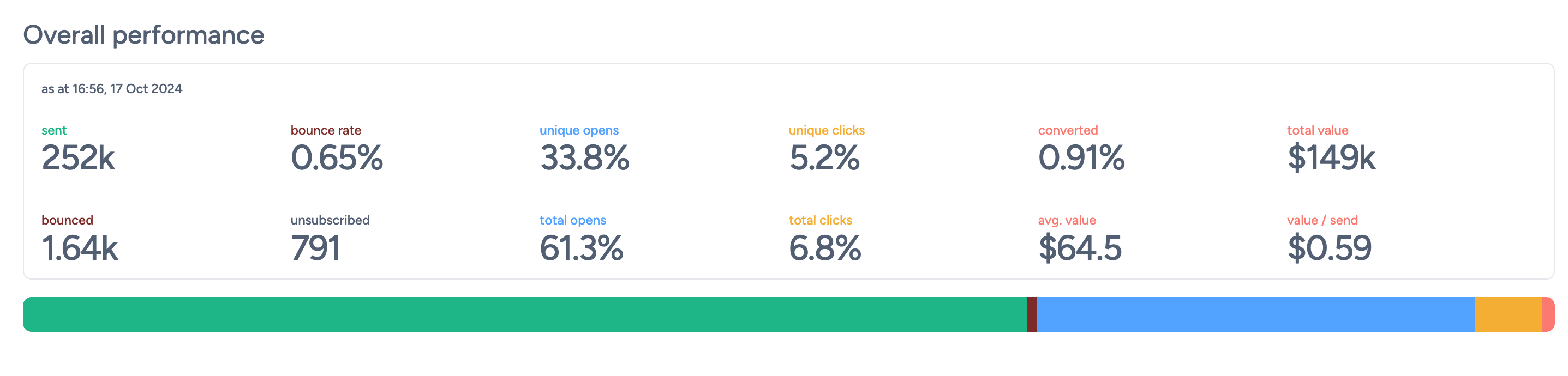
The overall performance graph is handy in displaying a general overview of your activity over the entire duration (from send date to present). The following fields are displayed above the graph:
Sent
Total emails/SMS messages sent.
Bounced
Total number of undeliverable messages.
Bounce rate (%)
Bounced messages as a percentage of sent messages.
Unsubscribed
Total number of subscribers who unsubscribed via this activity.
Unique opens (%)
Percentage of messages opened at least once. Note that a recipient can open a message multiple times, but this will only be recorded as a single unique open.
Total opens (%)
Total message opens as a percentage of sent messages. If messages were opened more than once on average, this number will exceed 100%.
Unique clicks (%)
Percentage of messages with at least one link clicked. Note that a recipient can click on links in a message multiple times, but this will only be recorded as a single unique click.
Total clicks (%)
Total clicks as a percentage of sent messages. This counts individual clicks on multiple links as well as multiple clicks on a single link within a message. If an average of more than 1 click has resulted from each message, this number will exceed 100%.
Converted (%)
Total number of conversions as a percentage of sent messages.
Average value ($)
Average value per conversion.
Total value ($)
Total conversion value.
Value/send ($)
Average conversion value per message sent.
This is an interactive graph allowing you to expand and contract the selected area using your mouse. The numbers shown above the graph reflect the selected date range. This graph is useful for seeing how well your email performs after the send date.
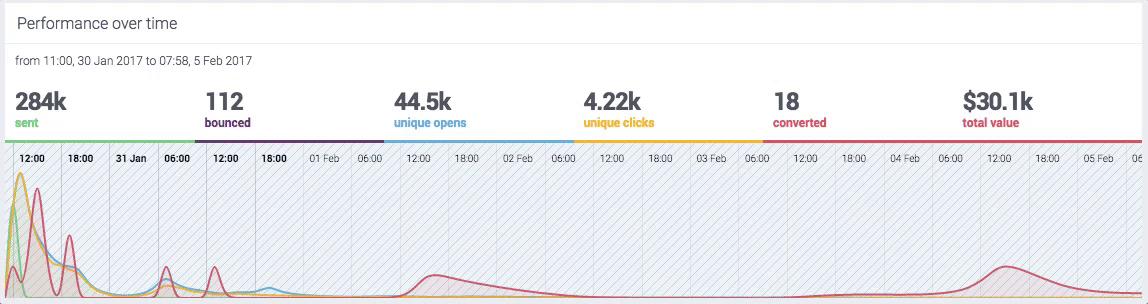
The following fields are displayed above the graph:
Sent
Total emails/SMS sent in the selected date range.
Bounced
Undeliverable messages in the selected date range.
Unique opens
Messages opened at least once per subscriber in the selected date range.
Unique clicks
Messages with at least one link clicked per subscriber in the selected date range.
Converted
Conversions from this activity in the selected date range.
Total value ($)
Total conversion value in the selected date range.
This section displays click performance for each link in your activity, with percentages showing total clicks.
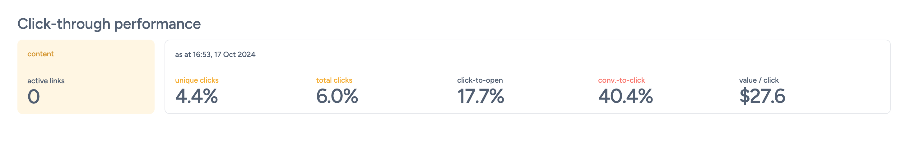
Additional statistics are availailable above the list including:
Additional stats are displayed above the graph:
Unique clicks (%)
Percentage of recipients who clicked at least one link.
Total clicks (%)
Total number of link clicks.
Click-to-open (%)
Clicks as a percentage of unique opens.
Conversion-to-click (%)
Percentage of clicks that led to conversions.
Avg. value per click ($)
Average conversion value per click.
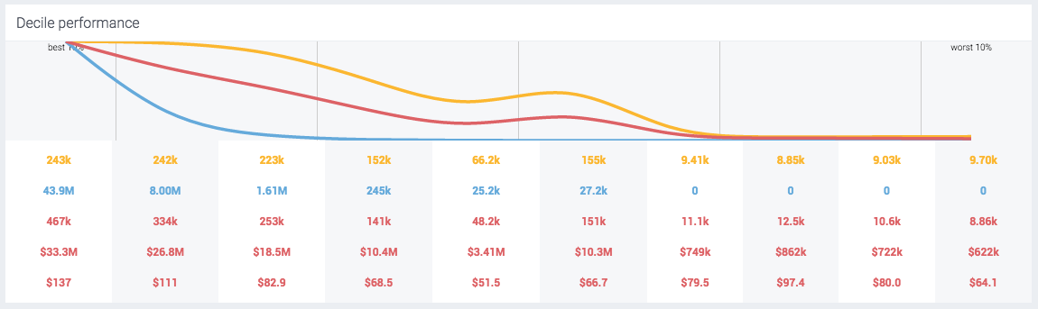
If your activity has multiple content or subject line versions/combinations, this section will display the performance of each variation and compare the best and worst percentile. Percentiles consist of those who received the full send (or defined combination), split into ten equal percentiles (100% ÷ 10). When broken down, each percentile is split using its key performing metrics such as engagement metrics and conversion metrics.
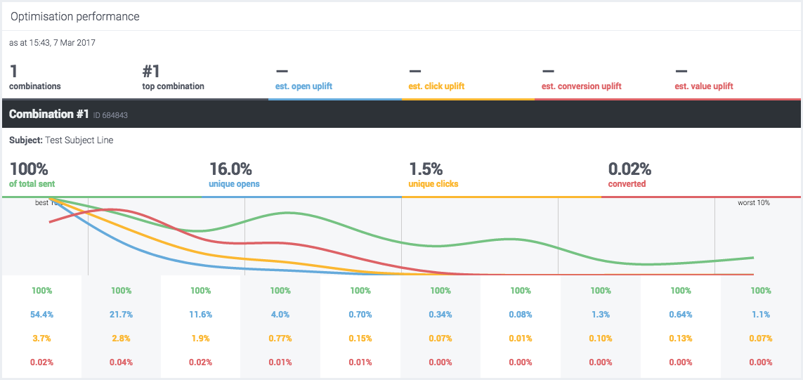
The charts at the bottom show how each combination performed across the engagement deciles of those who received it.
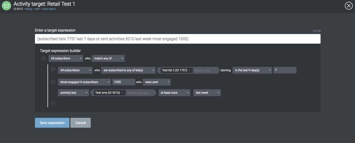
You can use these percentiles in future sends using target expressions. Say for example you would like to target the first 4 percentiles (40%) of the send (e.g. activity ID 123) in terms of engagement. You could use the following target expression in a new activity for a send target:
sent activities 123 most engaged 40%
To read more about using value limit options in target expressions and to see the full syntax, please read the full target expression reference.
Row 1 - The green row corresponds to the green line graph and represents the percentage of total sent within that 10%.
Row 2 - The blue row corresponds to the blue line graph and represents the percentage of unique opens within that 10%.
Row 3 - The yellow row corresponds to the yellow line graph and represents the percentage of unique clicks within that 10%.
Row 4 - The red row corresponds to the red line graph and represents the percentage of conversions within that 10%.
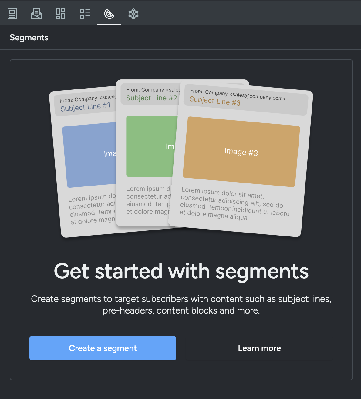
If your activity uses content segments (defined in the Segments tab of the activity editor), this section displays performance metrics broken down by each segment. This lets you compare how different subscriber groups — each receiving tailored content — engaged with the email.
The following metrics are displayed for each segment:
Sent
Number of messages sent to subscribers matching this segment.
Unique opens (%)
Percentage of recipients in this segment who opened the email at least once.
Total opens (%)
Total opens from recipients in this segment as a percentage of messages sent to it.
Unique clicks (%)
Percentage of recipients in this segment who clicked at least one link.
Total clicks (%)
Total clicks from recipients in this segment as a percentage of messages sent to it.
Converted (%)
Conversions attributed to this segment as a percentage of messages sent to it.
Total value ($)
Total conversion value attributed to recipients in this segment.
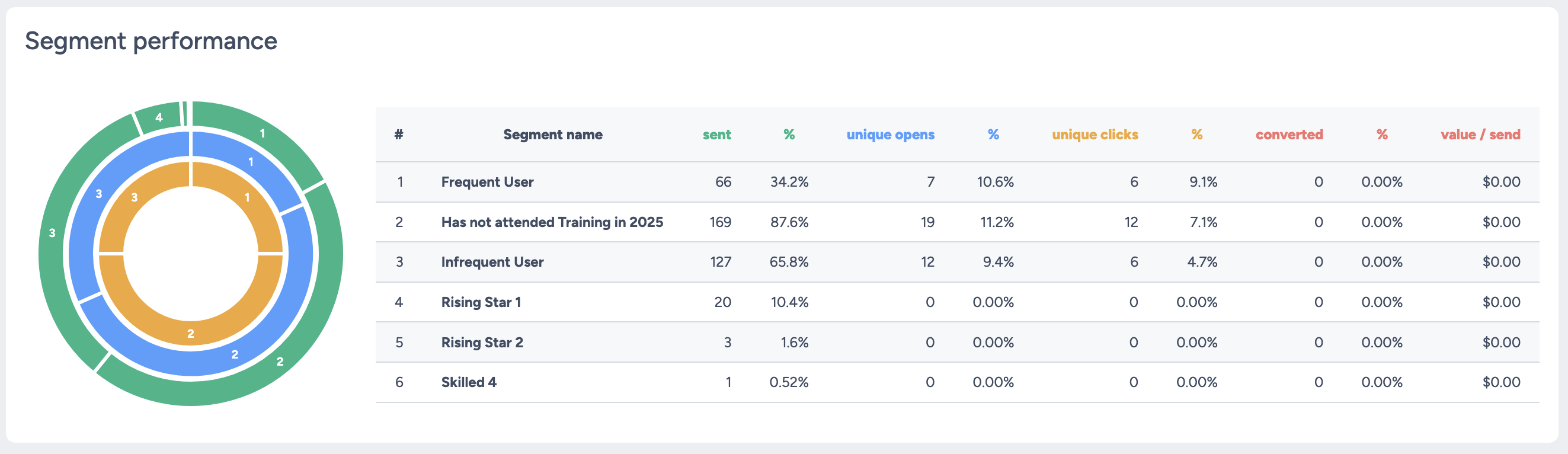
Segment performance reporting is useful for understanding how each content variant resonated with its target audience, helping you make data-driven decisions for future segmentation strategies.
Click-through heatmap
To see a more visual representation of clicks, a heatmap and click-map (total, % or ranking) is available. A colour injected heatmap will display on top of your activity content and will reflect the click activity recorded.
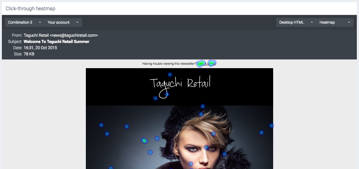
You can change the version/combination and change any test account variables in the top right corner. The top right corner contains a dropdown to switch between desktop and mobile views, along with a dropdown to change the map type (heatmap or click map).
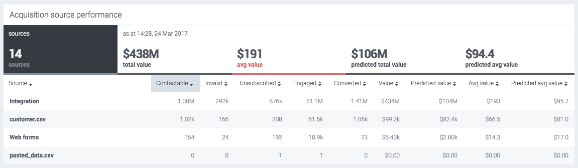
Bulk activity reports
Similar to bulk campaign reports, you can generate bulk activity reports.
Go into the Dashboard view or a specific Campaign folder. Hover over the activity tiles you wish to generate reporting and tick the checkbox for each activity. Once you’ve selected the activities, click on the ‘Generate a Report’ icon located at the top left corner of the Dashboard or Campaign view.
Once clicked, a CSV report will be instantly generated and downloaded to your device. Click here to read more.

 The Taguchi® v5 login screen
 The Taguchi® v5 login screen with OTP enabled

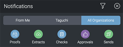
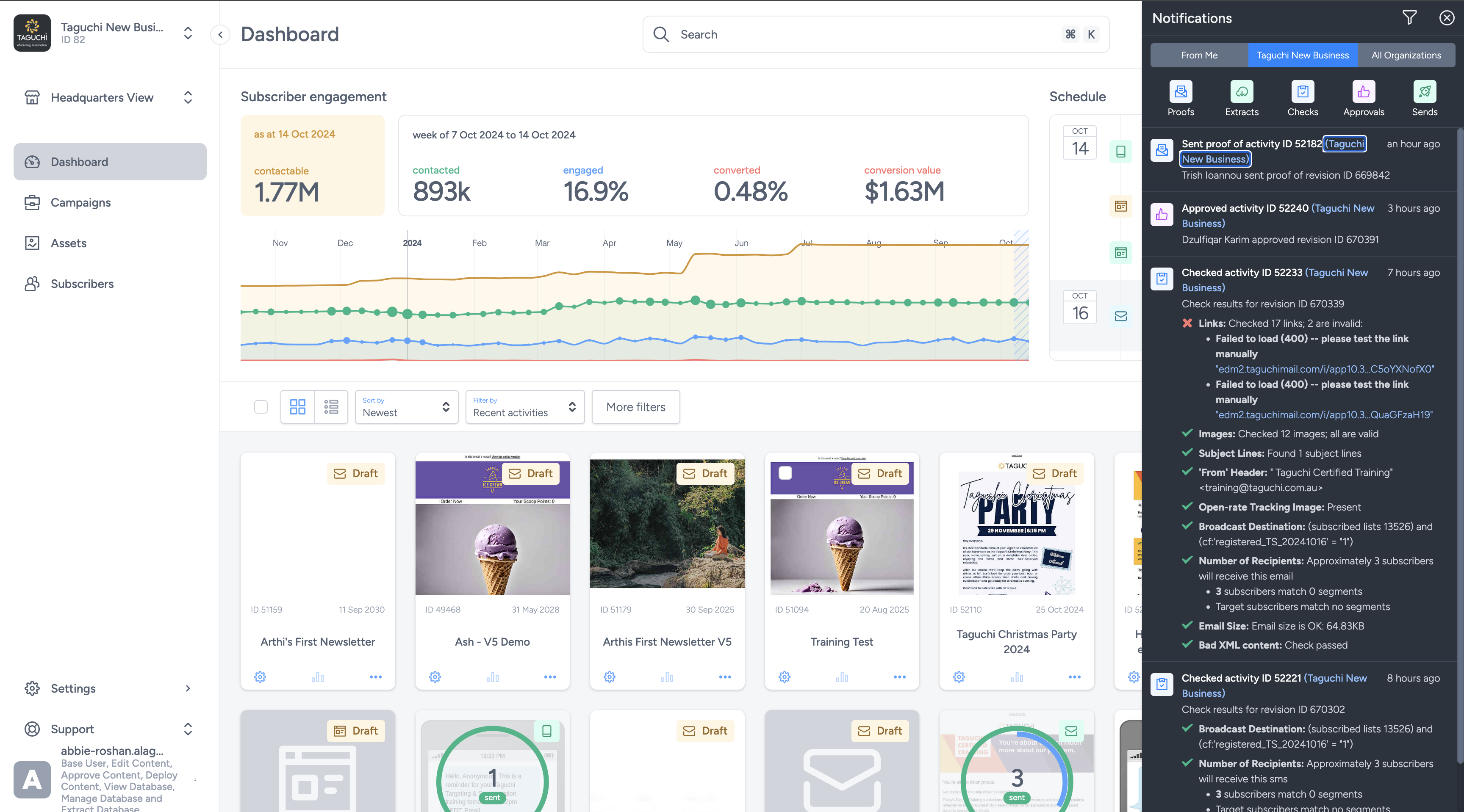 The notifications panel slides from the right of the UI and shows current activity status, approval updates and extract download links.
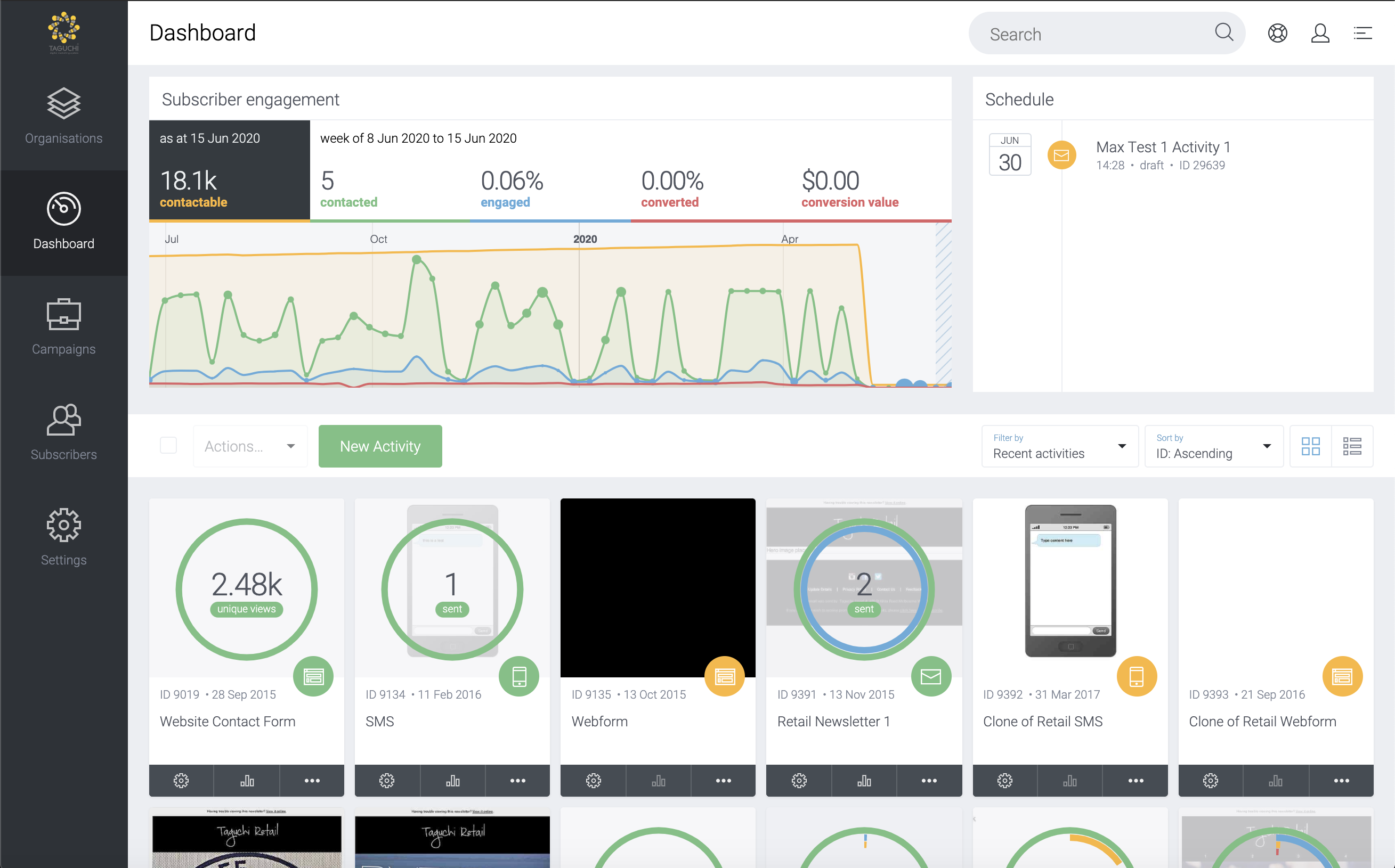 The dashboard contains an overview of your organisation within Taguchi.
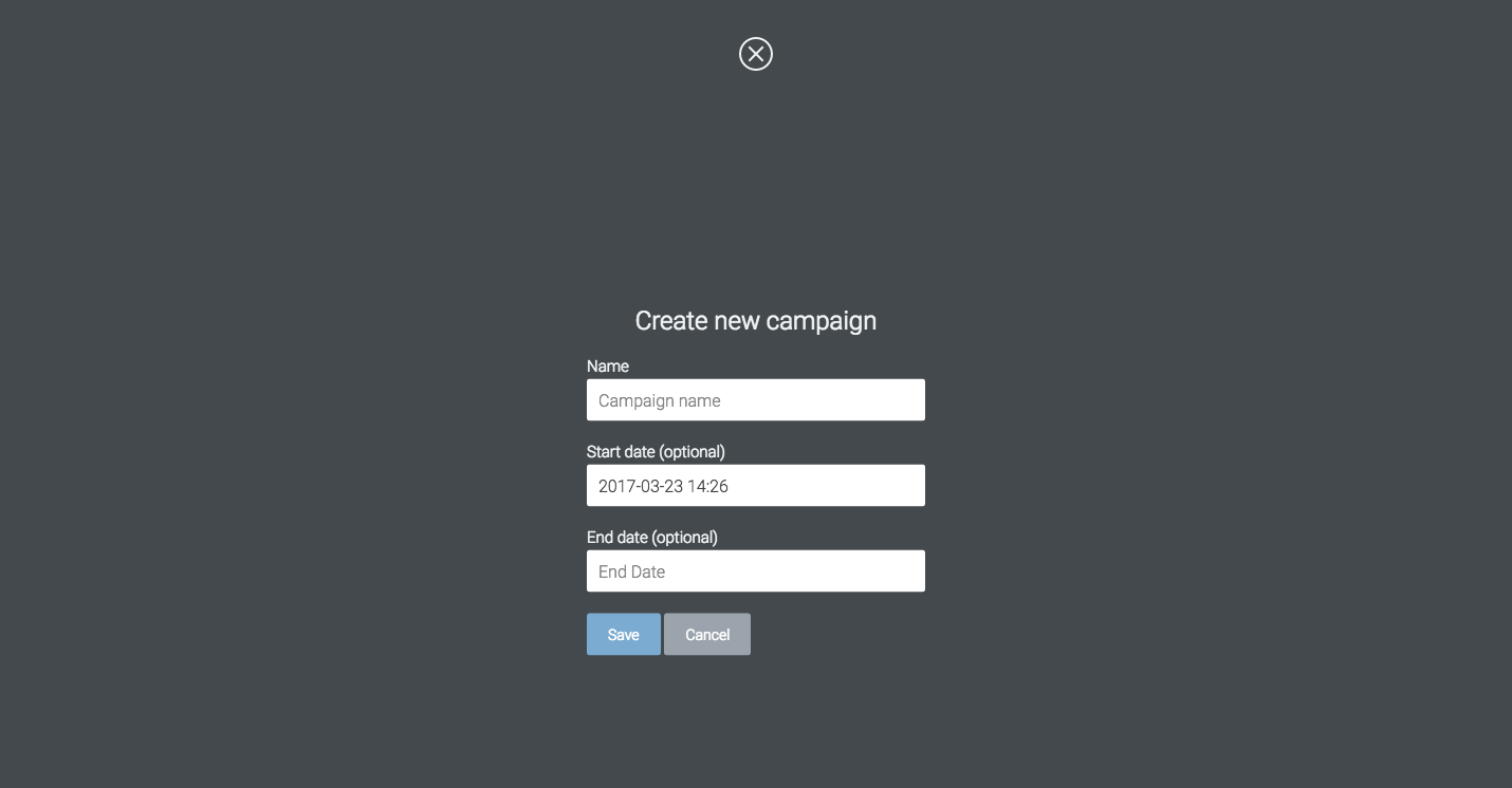 The 'Create new campaign' modal window will display. Enter in the required details and click 'save'.
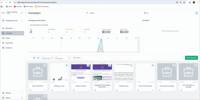
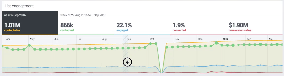
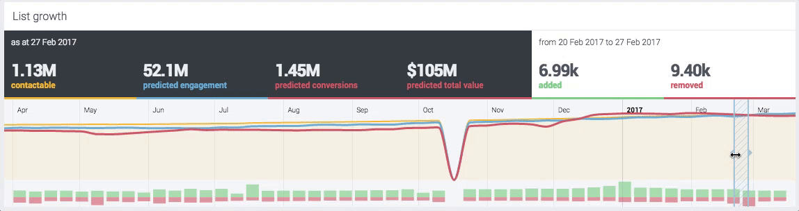
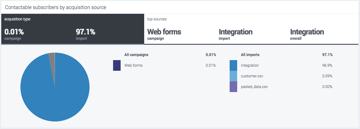
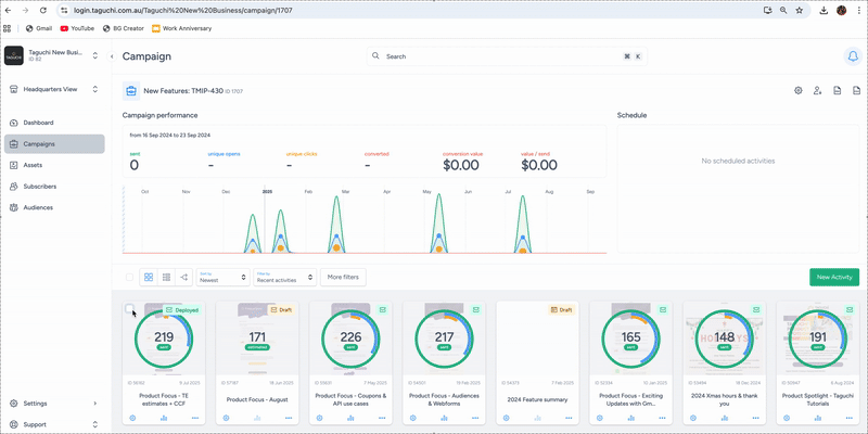
 Clicking the campaign tile will launch an online interactive graph report.
 A sample view of an online activity report.
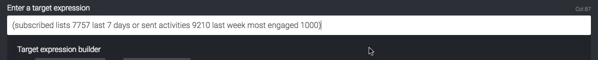
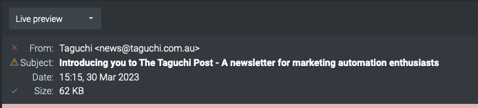
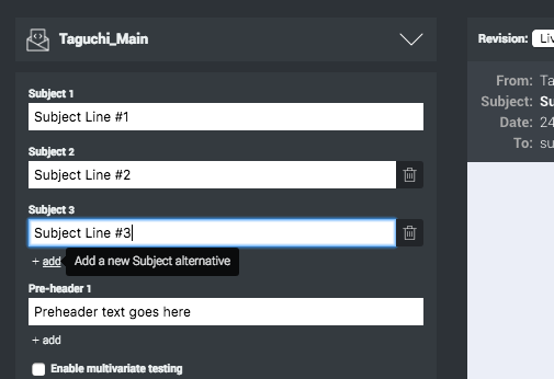
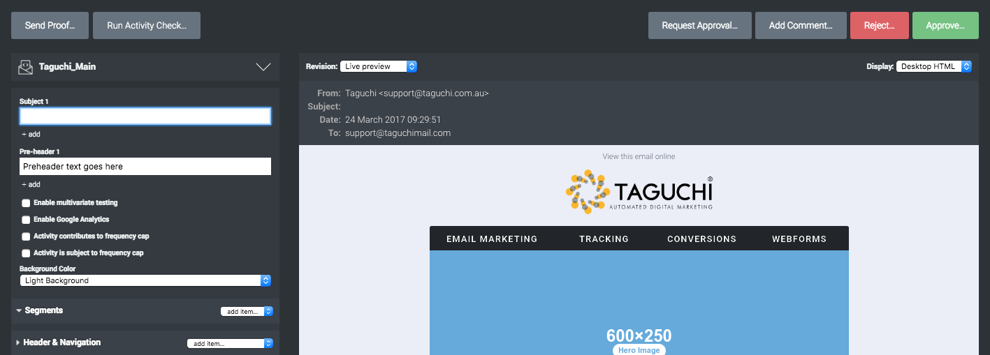 Easily change the subject line using the Subject fields.